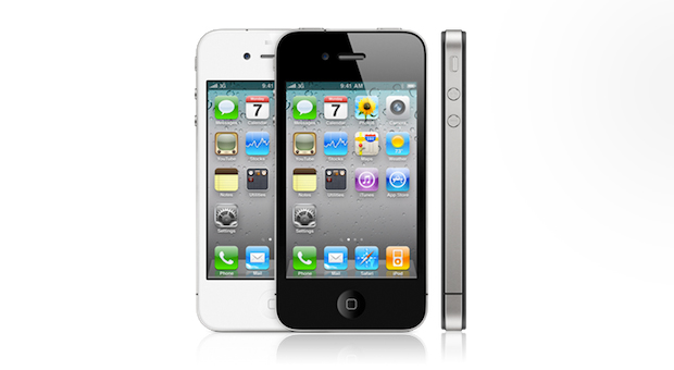
Welcome to the latest installment of The Flightpath Roundtable, where we gather various Flightpath employees for a discussion on the hottest topics in digital. Today, we’re talking about the iPhone 4S, the newest model in Apple’s vaunted line of smartphones. The announcement of the 4S, however, was met with mixed reaction. Many people were disappointed […]
Welcome to the latest installment of The Flightpath Roundtable, where we gather various Flightpath employees for a discussion on the hottest topics in digital.
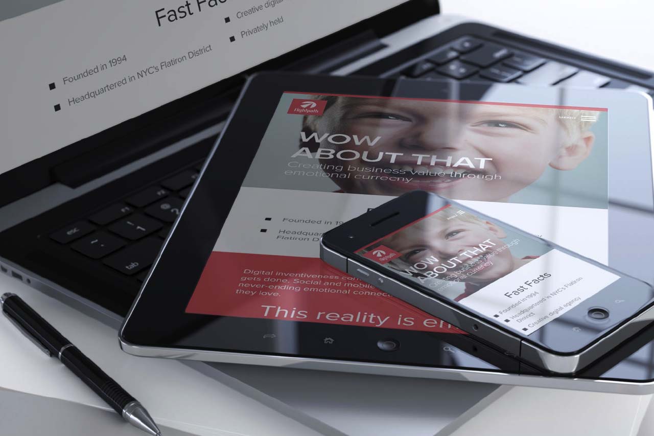
Today, we’re talking about the iPhone 4S, the newest model in Apple’s vaunted line of smartphones. The announcement of the 4S, however, was met with mixed reaction. Many people were disappointed that we’re not getting the iPhone 5, while others are happy with the upgrades of the 4S over the 4.
The participants in this discussion:
Dan Brooks, Digital Marketing Associate
John Lee, Director of Digital Marketing and Analytics
Cliff Medney, Chief Creative Strategist
John Whitcomb, Social Media Strategist
Dan: Alright, so we’re talking about the iPhone 4S. John Lee, I’ll start with you since you’re a big iPhone fan. What are your thoughts on the announcement of the 4S?
John L: Well, I wasn’t paying as much attention this time because I wasn’t planning on upgrading. I’m pretty happy with my iPhone 4. I know coming out with the 4S, and only the 4S, disappointed a lot of people. Especially when early reports indicated that they were coming out with different levels or tiers of iPhones for different price points. What seems to be the case now is that if you want the iPhone 3GS, you can get that for free [Laughs]. If you want the 4, you can get that for $99. If you want the brand new 4S, they are $200, $300, or $400.
I know it pissed off a lot of people who were expecting the iPhone 5. Personally, I’m not that surprised that the iPhone 5 didn’t come out. First off, they’ve been delayed with this product. With the iPad 2, they were running late with that [too]. But it doesn’t make sense for Apple to come out with a new product every year. I mean, this isn’t that different from when they launched the 3GS right after the 3G. To come out with a brand new product every year? I don’t think that’d be very smart. They cost a lot in R&D and a lot in production. Imagine what they have to do in China, refitting all those factories that they have – it just wouldn’t make any sense.
In terms of overall improvement, I’m glad I got the iPhone 4 when I did because it doesn’t seem like that huge of an upgrade from the 4 to the 4S. I’m sure you have a better camera and a better processor, but I don’t think they updated the RAM. And of course if you want the 64 gigabyte version, that’s great if you have a lot of media. But again, I don’t really see the huge improvement. It didn’t get as much hype as it usually would because of Steve Jobs [dying].
Dan: If they called this the iPhone 5, it would have been a huge disappointment, right?
John L: Yeah, they’d have to come out with a completely different design to call it the iPhone 5. You saw those leaked patented schematics of what the new iPhone is probably going to be – whether they were fake or not, I don’t know. It would have been nice to see a iPhone 5, but I’m not surprised it didn’t come out this year.
Dan: I was waiting and waiting for the iPhone 5! I was all excited and when I saw the iPhone 4S, I was like, “What the hell is this? I’ve been waiting so long!” [Laughs] But I think it’s a pretty awesome piece of hardware, so I’m excited to get my hands on it.
John L: Even the 4 is still a pretty slick device. The retina display is excellent.
Dan: [to John W] You have a 4? What do you have?
John W: I have a Droid Incredible.
Dan: Oh! As a Droid user, what do you think of the iPhone and iPhone 4S?
John W: I think that the iPhone is fine. One of the main reasons I’ve always had a Droid is that we’ve been with Verizon, and for a while the iPhone was only on AT&T. Now that it’s available on Verizon I guess I can switch, but I haven’t yet because of my comfort level with the Droid. I like the Android operating system.
I was surprised. I really thought they were [going to announce the iPhone 5]. Unlike what [John L] said about not being surprised, with all the hype surrounding it, I was expecting the announcement for the iPhone 5. I think a lot of people were and that there was a lot of disappointment. I don’t know if I would call it an absolute failure, but there was a lot of negative buzz that was produced using the 4S versus the 5.
I thought one of the most interesting things was all the rumors that led right up to the day, including what carriers were going to be allowed to do it. There was a rumor spreading that Sprint would have sole access to [the 4S or 5] when it first came out, and then they would allow other carriers to do it. Sprint hadn’t even carried the iPhone up to that point. But it was a ridiculous amount of money that they were going to pay to have exclusive access and they were going to have to buy a lot of iPhones from the company. That was interesting to me, as a person who doesn’t even have an iPhone, but from a marketing perspective.
Dan: You use an iPhone, right Cliff? Are you upgrading to the 4S?
Cliff: No, no. Maybe the 5 when it comes out. I guess I have 2nd or 3rd generation, and it’s just delightful. So I don’t know how much more of a kick that I would get from an upgrade. Do I use, in my limited way, even 70% of what this thing has to offer? You know, I would imagine I haven’t maxed out. If there was anything I hear about anything that’s better, it’s the photography. I take a lot [of photos] so that would be nice.
Dan: One of the big criticisms I heard a lot when the iPhone was first introduced was that it does the “i” part great, but not so much the “Phone” part. There were a lot of dropped calls. Has that improved, especially with the 4 and going forward?
John L: I mean, I’ve always been on AT&T for as long as I can remember. In terms of reliable signals, it’s always been kind of a problem. I hadn’t really noticed the difference when I moved onto the iPhone. I have nothing else to benchmark that against. I understand that Verizon is supposed to be pretty reliable, but I’ve also heard people say that it’s just as bad.
Dan: People seem to put up with it for whatever reason.
John L: Yeah. I think in large metro areas like New York, everyone’s on their devices which puts a lot of demand on their network. Whether or not that’s a cause, I don’t know.
Dan: And what about the impact of having an iPhone or a smartphone on your lives?
John L: In a city like Manhattan, it definitely comes in handy when you need to find a restaurant or you’re trying to navigate through the city. It’s just very convenient to have something like this at your disposal.
John W: I mean, I feel naked when I don’t have it on me for few minutes. I feel lost without it. I use it every day, from the morning when I get up to track mileage expenses, to navigating the city if I don’t know exactly where something is, to looking up a quick bite to eat, to keeping on top of Internet stuff to being able to connect to email.
Cliff: Yeah. In its simplest form, it is a device. I used to carry around little pads and a pen everywhere because I would have an idea or notion that I would need to write down, or I would forget. So now [I just use] the notes section of this thing, and if I think it’s actually worth sharing, if not profound, I can then email it [to myself or others]. So as a device that expedites either the sharing, the development, the capture, [it’s great]. Then when I sync it up with my home computer, I have storage of it. I don’t have to…[holds up notebook filled with scribbled notes and ideas]
Dan: …carry that around? [Laughs]
Cliff: [Laughs] It’s not a pretty picture. So I think as a device, it is so multifunctional that it does help you navigate life differently.
John W: What he said I think is about smartphones in general, not just iPhones.
John L: But we have to also acknowledge that smartphones have really been following what iPhone has sort of designed. If you look at all the smartphones now – the UI, everything – they are all pretty much designed from Apple. I like the Android operating system, I think it’s a great operating system, but let’s face it. It’s still the UI that is pretty much taken from Apple’s design.
Android has the market share right now. I think it has almost twice as much market share as Apple has in the US. You know, I don’t take anything away from Android. I think it’s a great operating system. The Samsung Galaxy 2 is pretty fast – it’s more powerful than the new iPhone 4S, but I don’t know. I just like the iPhone. I think it’s a little bit more slick with the industrial design.
Dan: The 4S, I was just reading, has broken sales records so far with preorders. So it looks like it’s paid off – the announcement and everything. People were waiting for it. It’s going to be a success.
John L: I think so.
Cliff: The notion of trading up is so compelling. All of these different smartphones. The idea that you can so easily trade up these days and get the best. It’s pretty hard to say no. The barriers to entry…
John L: Well that’s just the thing, too. The barriers are getting smaller and smaller. Smartphones are pretty much for everyone now and are becoming commodities. The iPhone is somewhat of a commodity now too, since they are giving away the 3GS for free. It’s pretty much, anyone can have a smartphone these days, and pretty much everybody does.
Cliff: Right. I mean, can you imagine in a year? I have a flip phone too that is like, my kids’ hotline. But you’re going to see someone with a flip phone and it’s going to turn the whole Apple/iPhone thing on its head from 5 years ago, when you would see someone with it and think, “Oh my god, that’s amazing.” Now you’re going to think how bizarre [a flip phone] is in a year. So there’s iPhone years like there is like dog years.
Dan: What about going forward? Do you think that this would be a new model where Apple might take their time before introducing a full-fledged new model like the iPhone 5 or iPhone 6, and then have these updates in between?
John L: You know what? I hate to say it, but with Steve Jobs gone, who knows what’s going to happen.
John W: The updates kind of remind me of operating system updates. Where you know, you had Windows 98, and then Windows ME, Mac 10.3, Mac 10.8, or however the Mac operating systems go up. It’s the same kind of thing. You always feel like you have to be at the top level to be “in.”
Even though it broke the sales records, one of the questions that I would have asked people is if they are truly happy they got the 4S, or if it was more, “Well, that’s what they had.”
Dan: With the announcement of the new phone?
John W: Yeah.
Dan: I think the danger if that would be the model is it could kind of water down the iPhone brand. It creates some confusion. There’s something about the 4S that feels…I said something to my friend like, “I don’t want to get a stop-gap device.” You know? And maybe it’s not [exactly a stop-gap], but it’s not the iPhone 5.
John L: Let’s face it. With the launch of every iPhone, there is something that people are going to be very critical over. Just like when the first iPhone came out, it was like “Oh my god, it doesn’t have 3G.” And so they came out with a 3G version. What did people complain about with the 3G version? “It doesn’t shoot video!” There’s always something that people complain about, but people keep buying it. It’s still a very slick device. I have yet to see a phone that’s as well built as an iPhone.