Denise de Castro

Read This Before Trying Headless CMS for Your Website

A depiction of headless CMS using a robot extending to different viewing platforms.

Audiences are continually consuming information in different capacities, and your website is no different. Remember when everyone accessed content on a desktop? Fast forward to mobile entering the picture, then overshadowing desktop consumption. Along came mobile-optimized and responsive websites. 

Now we’re seeing content consumed across multiple platforms, including mobile apps. From a user experience the most important thing is to connect with your customers in a way that most resonates with them–for websites that translates to building something that is easy to use and quick for them to digest what’s important, and what they’re searching for. 

From a development standpoint, building something that can easily adapt is key. Creating a well-built website is no joke. It takes time, planning and man hours–all things that most companies need to work into their budget and growth strategy. So how do you share all that content without building out the front-end for each separate device? Enter the headless CMS. 

What is a headless CMS?

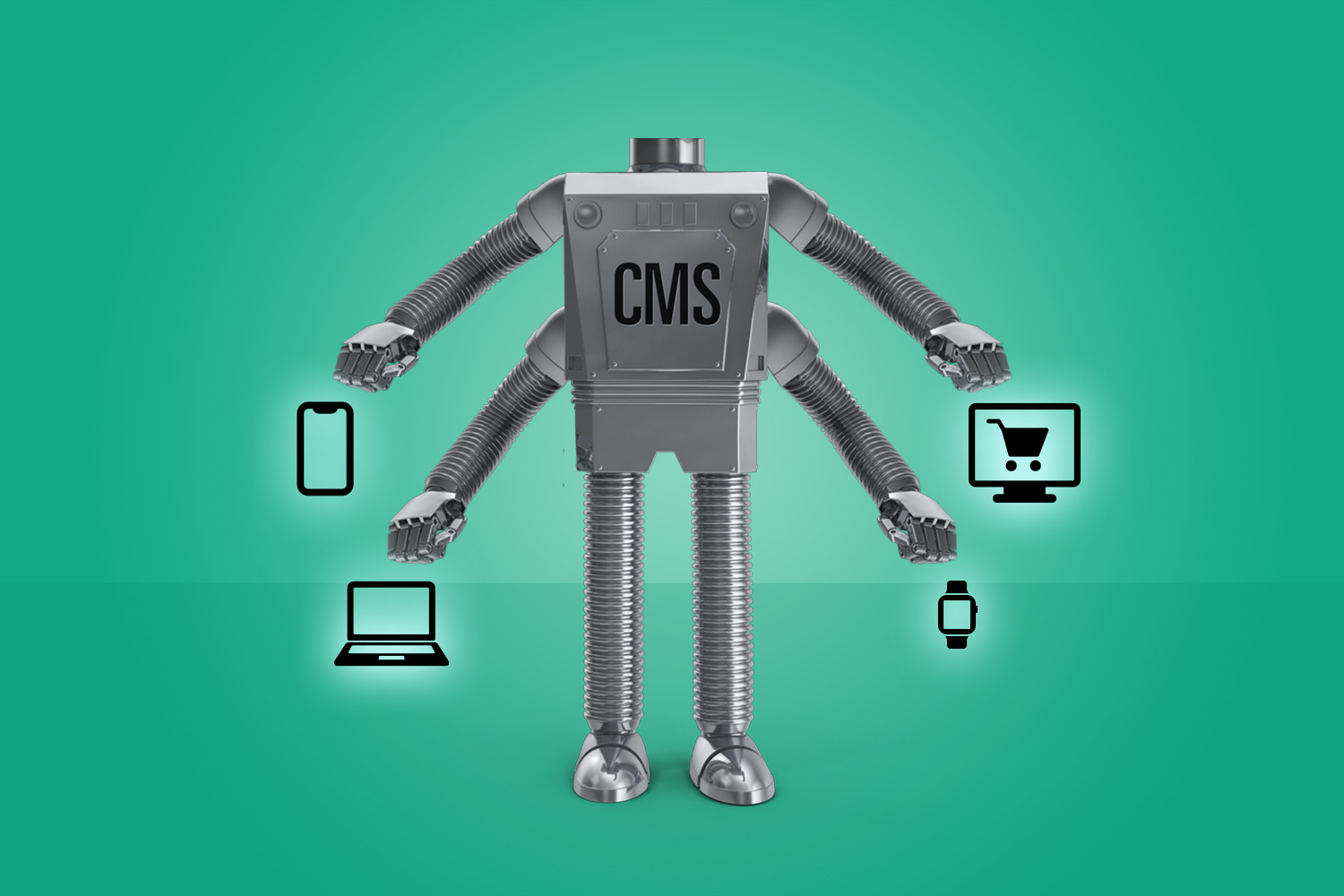
A headless CMS is a content management system (CMS) with only a backend. The function is to be more of a repository, think about it like the database storing all of your website information. The content is then accessible via a RESTful API that can be displayed on any device.

The term “headless” is fairly literal to what is happening. The concept is that we are removing the “head” (the front end, or website) off the “body” (the back end, or content repository). A headless CMS’s core functions are to store and deliver structured content.

Why use a headless CMS?

Just like most solutions, a headless CMS is not a need for every company or website. It is built as an option for those who could benefit. For one example, a headless CMS creates greater flexibility for developers but not designers. At a basic level, a headless content management is best used for:

  • Content that needs to be published across various platforms
  • Websites with a lot of content across many pages
  • Websites and apps utilizing JavaScript frameworks (e.g., VueJS, React or AngularJS)
  • Websites created with a static site generator (e.g., Gatsby and Jekyll)

Headless CMS Options

Two of the most popular options are WordPress and Drupal. While these can have multiple ways to create a website, both can be fitted to accommodate headless CMS.

In the case of WordPress, your data can be made headless by using plugin functions like the WordPress REST API and Create React App. This allows the functionality and flexibility a headless CMS needs. 

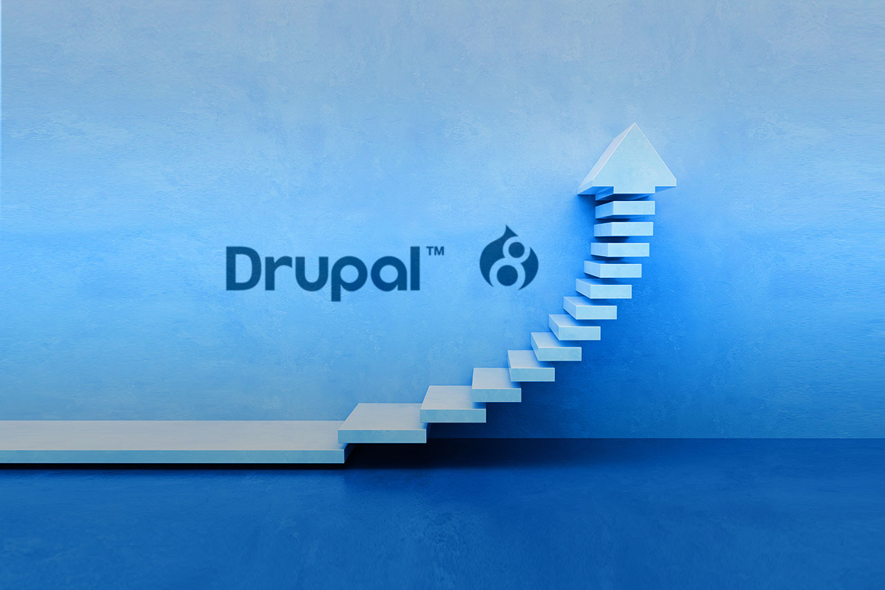
Drupal 8 is also referred to as “decoupled Drupal,” and is a very popular option for headless CMS. This system has an API-first architecture. This focus helps if your company strategy involves targeting mobile, resellers, or the multi-platforms we’ve discussed here already. Drupal core comes with the RESTful Web Services module. Drupal 8 is currently used by Weather.com, The Tonight Show, and Warner Music Group. 

Should You Use Headless CMS? 

Like all good planning and management, the best way to decide if a headless CMS would benefit your data would be to have a clear strategy for your audience and their needs.

  • How is your audience consuming content?
  • What flexibility do you need?
  • How many pages of content do you need? 

Asking a few questions like these can help uncover the pros and cons for your brand, and lead developers to create the best solve for your website. 

ADA Compliance and PDFs

blog-pdf-ada

From a business standpoint, it makes sense to ensure your website is as accessible to a wider audience as possible, including those with blindness or low vision, deafness or hearing loss, learning disabilities, cognitive limitations, limited movement, or combinations of these. This matters just as well from a legal compliance standpoint, as there have been […]

From a business standpoint, it makes sense to ensure your website is as accessible to a wider audience as possible, including those with blindness or low vision, deafness or hearing loss, learning disabilities, cognitive limitations, limited movement, or combinations of these.

This matters just as well from a legal compliance standpoint, as there have been many case studies of lawsuits filed for companies failing to ensure sufficient website accessibility as codified into law by the American Disabilities Act (ADA).

However, this does not only apply to your website. It is just as important to review all electronic documents that a visitor would access on your website, particularly PDFs.

These best practices will help to ensure that your PDFs are compliant with accessibility standards:

Files & Content

  • Use proper headings within the document to clarify sections, i.e. H1, H2, H3.
  • When naming, the document file name should not contain any spaces or special characters.
  • The document file name also needs to be concise, generally limited to 20-30 characters, and should clarify the contents of the file.

Organization:

  • Tag all PDFs. Documents must be tagged to allow checking for Section 508 accessibility.
  • All Document properties/Meta Data should be filled out Title, Author, Subject, and Keywords.
  • Add Bookmarks in documents longer than nine pages to aid in navigation. Bookmarks should match the headings used in the document.

Extra Features

  • Images must have alternative text to help describe what is there. This is a common problem in webpages and in PDFs.
  • Set the column and row headers for simple & complex tables.
  • Enable Assistive Technology access.

For more information on making your PDF’s ADA compliant, including a verification tool, check out this page from Adobe Acrobat.

Is Your Website ADA Compliant? Part 3 – Programming Best Practices

So far we covered the high-level guidelines that should be followed to conform with the Web Content Accessibility Guidelines 2.0 AA (WCAG 2.0 AA) and design best practices. This post will focus on coding and ADA compliance. Developers should make best efforts to make website accessibility part of their everyday workflow instead of a last-minute […]

So far we covered the high-level guidelines that should be followed to conform with the Web Content Accessibility Guidelines 2.0 AA (WCAG 2.0 AA) and design best practices. This post will focus on coding and ADA compliance.

Developers should make best efforts to make website accessibility part of their everyday workflow instead of a last-minute task. It’ll save development and testing time. Here are a few guidelines to follow for modern website accessibility development:

  • Use proper document structure
  • Allow users to skip to the main content area
  • Set language attributes
  • Enable zoom
  • Describe images where applicable
  • Keep animations simple

Use Proper Document Structure

Do you remember when you learned how to code your first HTML page? There were, and still are, semantics that must be followed.

  • Be sure to follow the proper hierarchy of h1 to h6, and don’t use these tags solely for styling purposes. Doing so will also provide an SEO benefit. The following code shows a few headings with some content under them.

    Proper use of heading tags
    Proper use of heading tags
  • Use Ordered Lists when importance is needed
  • Use Unordered Lists when no importance is needed

Allow Users to Skip to Main Content

“Skip to main content” allows users to bypass the nav when using tabbed navigation.

    Tip: If this interferes with design aesthetics, hide it with CSS via a hidden attribute.

Set Language Attributes

Every page of your website must have a language assigned. Setting every page’s HTML language is an easy way to help your users, including those using assistive technology, to browse your website. Screen readers will pronounce words depending on the HTML language assigned to your website. You can set the language in your template by using the tag <html lang=”en”>.

Enable Zoom

For a website to meet the WCAG 2.0 AA standard, a user should be able to scale the page up to 200%. Be sure to enable your mobile users to zoom freely on their devices, and also check that your layout looks good in desktop browsers.

Describe Your Images Where Applicable

Alt Tags

By default, images are not accessible. Be sure to use alt text for images that need it, up to 140 characters in length. While alt tag descriptions are not necessary for decorative images, it is acceptable to use alt=””.

<img src=”bird.jpg” alt=”Parrot perched on a branch.”>
<img src=”decorative-image.jpg” alt=””>

For logos that link to the homepage, use alt=”Homepage” rather than “logo.”

Aria Tags

Charts and graphs can use an aria-describedby tag and link elsewhere.

<img src=”graph.jpg” aria-describedby=”desc” alt=”graph”>
<a href=”GraphDesc.html” id=”desc”>Get Graph details”</a>

Scalable Vector Graphics

SVGs should be accessible for everyone. In order to describe vector images, use the <title> and <desc> tags for short and long descriptions.

Keep Animations Simple

It’s important to allow the user to skip/pause the animations and avoid excessive use of animations and parallax. Make sure your video, animation, or other multimedia product does not contain flashing, strobing, or flickering elements as they can cause some people to experience seizures, dizziness, and nausea. You can use the Photosensitive Epilepsy Analysis Tool (PEAT) Tool to see if your content falls in these ranges.

Is Your Website ADA Compliant? Part 2 – Design Best Practices

In our previous post, we covered the high-level guidelines that must be followed to conform with the Web Content Accessibility Guidelines 2.0 AA (WCAG 2.0 AA). This post focuses on design best practices and ADA compliance. Some design guidelines to follow for modern web accessibility include: Take into account Color Blindness Design page text with […]

In our previous post, we covered the high-level guidelines that must be followed to conform with the Web Content Accessibility Guidelines 2.0 AA (WCAG 2.0 AA). This post focuses on design best practices and ADA compliance.

Some design guidelines to follow for modern web accessibility include:

  • Take into account Color Blindness
  • Design page text with sufficient contrast. Ensure the contrast ratio between text and background is at least 4.5:1.
  • Do not use images of text.
  • Keep animations simple.
  • Touch targets must be large enough for the user to interact with.

Color Blindness

Color Blindness is the difficulty distinguishing between certain color combinations. The most common is red-green color blindness. The table on below shows five example color pairs of confusion.

Red-Green Color Blindness table
Source: http://www.color-blindness.com/red-green-color-blindness/

As severity and type of color blindness can be very different, such color pairs are quite individual. When designing your website, ensure that colors are not your only method of conveying important information. For example, do not use red text to denote errors in forms.

Color Contrast

To comply with WCAG 2.0 AA level requirements, the color contrast ratio must be 4.5:1 for normal text (less than 18 point or 14 point bold) and a contrast ratio of 3:1 for large text (at least 18 point or 14 point bold). Paciello Group has a useful Colour Contrast Tool that helps you determine the legibility of text and the contrast of visual elements, such as graphical controls and visual indicators.


Snapshot of the Colour Contrast Analyser tool

Images of Text

Do not use images of text. Images are more likely to distort and pixelate when resized. It is good design best practice to style text with CSS rather than using image-based text presentation.

Keep Animations Simple

Allow the user to skip/pause the animations and avoid excessive use of animations and parallax. Make sure your video, animation, or other multimedia product does not contain flashing, strobing, or flickering elements as they can cause some people to experience seizures, dizziness, and nausea. You can use the Photosensitive Epilepsy Analysis Tool (PEAT) Tool to see if your content falls in these ranges.

Touch Targets

Content touch targets must be large enough to read and have a large enough interactive target area to tap comfortably with one finger. In addition, you should also ensure there is enough space between touch targets so that the user does not interact with the wrong element.

Is Your Website ADA Compliant? Part 1 – Guidelines and Tools

Web accessibility is the practice of making websites and apps usable for everyone, including people with disabilities. There are many reasons to make your website accessible. Not only does it broaden your audience to those with disabilities, creating an accessible web experience also improves SEO and usability.

In 2017, the number of federal lawsuits about allegedly inaccessible websites totaled at least 814. This is well over the 262 lawsuits that were filed in all of 2015 and 2016. This makes it even more important to correct any issues that prevent your website from being accessible.

Web Accessibility Guidelines

Website accessibility is usually an afterthought and it often requires rework, redesign and recoding. When starting a new project or making corrections to your existing website, you should conform with the Web Content Accessibility Guidelines 2.0 AA (WCAG 2.0 AA).

Here is a rundown of some guidelines to follow for modern web accessibility:

  • Design page text with sufficient contrast. Ensure the contrast ratio between text and background is at least 4.5:1.
  • Provide text alternatives and captions for non-text media (videos and images).
  • Do not use images of text.
  • Use clear headings and labels.
  • Ensure the keyboard focus is clear and visible.
  • Use all menus, icons and buttons consistently.
  • Ensure form input fields have a description that is explicitly associated with the field to make sure that users of assistive technologies will also know what the field is for.

What are the next steps?

Companies should run an accessibility scan of their website. There are numerous free online tools that can be used, including wave.webaim.org, www.siteimprove.com, and developer.paciellogroup.com/resources/contrastanalyser. These tools will provide an overview of potential issues that need to be resolved by your developers.

Siteimprove has a free Google Chrome Accessibility Checker

Siteimprove has a free Google Chrome Accessibility Checker

Next, take a look into getting ADA compliant before you receive a demand letter.

WCAG 1.0 was first published in 1998, and its latest update, WCAG 2.1, is in development and is expected to be published as a standard later this year. Be sure to review your website again to ensure it conform to the latest set of standards.

Stay tuned for our next post in the series where we focus on design elements.

When to Move to Drupal 8

When to upgrade to Drupal 8

Drupal is an open source content management platform that is used by 8% of the Top 10k sites. Major websites that utilize Drupal include Memorial Sloan Kettering, Whole Foods, and The White House. Drupal 8 launched in November 2015 with hundreds of improvements, making it easier to use for both developers and site administrators. Since […]

Drupal is an open source content management platform that is used by 8% of the Top 10k sites. Major websites that utilize Drupal include Memorial Sloan Kettering, Whole Foods, and The White House.

Drupal 8 launched in November 2015 with hundreds of improvements, making it easier to use for both developers and site administrators. Since its release, there are 111,000 websites running Drupal 8, while over 1 million are still on 7.
 

So the big question is – When should I move my site to Drupal 8?

If your website is running Drupal 6, you should upgrade to D8 ASAP. D6’s end of life was in February and sites will no longer receive security updates for the platform and modules won’t be maintained.

For those on Drupal 7, there isn’t a rush to upgrade as the end of life for D7 will not be until at least 2019. Drupal 7 will be supported at least until 3 months after the 9.x LTS release comes out, for which a release date has not been set.

If you are building a new website, go straight to Drupal 8. It will be time and cost effective to start with a new D8 install.
 

A Comprehensive Guide to Umbraco

A Comprehensive Guide to Umbraco

READ NOW

Upgrading to Drupal 8

Moving to Drupal 8 is not just an upgrade. Like any other project, you must allocate the proper budget, timeline, and resources. Developers will need to rebuild and migrate the site. There may also be a learning curve as D8 uses the Twig templating system and uses object oriented programming.

A couple items to consider:

  • Contributed Modules – Review the modules on your current install and see if there is a Drupal 8 version. Be sure to use a stable version of the module, not a release candidate (RC), alpha or beta.
    There is a free web service called D8upgrade which scans your website and generates a report on the status of your site’s contributed modules. You can also install Upgrade Status. The module checks the list of your installed modules and shows their availability for the new version of Drupal. Its dashboard will show you notes about upgrading the project, as well as a link to download the new version.
  • Migration Process – Drupal 8 core includes the Migrate module which allows you to migrate content from your D6 or D7 site.

As we mentioned, be sure you’re equipped with the necessary resources to move to Drupal 8 before beginning the project. Best of luck with the move!

See if Umbraco is Right For You

Need a new CMS?
See if Umbraco is
right for you.

GET THE WHITEPAPER

DrupalCon New Orleans Recap

DrupalCon is the name given to global conferences where members of the growing Drupal community, including developers, system engineers, designers, project managers, functional analysts, and more, gather to participate in learning sessions, talks, code sprints, and social events. Last week, Flightpathers Denise and Bart were part of the 3,102 attendees who attended DrupalCon in New Orleans. DrupalCon Takeaways Drupal 8 […]

DrupalCon is the name given to global conferences where members of the growing Drupal community, including developers, system engineers, designers, project managers, functional analysts, and more, gather to participate in learning sessions, talks, code sprints, and social events. Last week, Flightpathers Denise and Bart were part of the 3,102 attendees who attended DrupalCon in New Orleans.

DrupalCon Takeaways

Drupal 8 launched last November with hundreds of improvements, making it easier to use for both developers and site administrators. Translatability and localization out of the box, enhanced accessibility and WAI-ARIA compliance, REST-first native web services, and mobile-first, responsive, HTML5 output are just a few features that make D8 better than D7.

Drupal 8 has a large adoption rate. Within the 3 months of release, 60,000 websites have been developed. Popular companies that use Drupal include Tesla, The Weather Channel, Pfizer, Cisco and Nike.


Drupal 8 Features and Enhancements

Common Drupal 7 modules are now part of the Drupal 8 core like Display Suite, custom blocks, and views. This makes it easier for developers to build websites. There will no longer be a need to search for common modules and installing them. We loved the Lego cruise ship analogy presented by Josh Koenig of Pantheon:

DrupalCon New Orleans D7 Analogy of modules - you have to pull different modules to build a site. Looks a little sloppy doesn't it?
D7 Analogy of modules – you have to pull different modules to build a site. Looks a little sloppy, doesn’t it?
DrupalCon New Orleans D8 Analogy of modules - you get a better looking cruise ship
D8 Analogy of modules – you get a better looking cruise ship

Markup

All markup is now in Twig templates. That means developers can control HTML output and attributes like classes, data, IDs, and more. In Drupal 7, HTML was messy and there was no control over classes or IDs you had no control over it, making it hard for a developer to add/remove classes from HTML elements. Now with D8 you can easily control HTML elements and classes with TWIG templates. Only downside is that need to learn twig template engine but once you learn it, it will make everything easier.

CSS and Javascript

Drupal 7 typically outputs all CSS and Javascript files regardless if it is called on the page/node. Drupal 8 now has libraries that will include global or node-specific files.

Pattern Lab

Pattern Lab is a custom static site generator. We have used it for several projects and were pleased to learn that developers can combine a Twig version of Pattern Lab with Drupal 8. You can build out front end code once designs are produced and there no longer is a need to wait for a backend developer to build the site. You can just copy and paste the Pattern Lab CSS and code (or sync it with Grunt) to your Drupal theme, change a few class and ID names, and, voilà, you’re done.

Integration with Javascript Frameworks

Since you have full control of the markup and attributes, you can integrate with Ember, Angular, or React.js.

Other Takeaways

Security

We all know credit cards are important. Security on your site is more than just a credit card – that’s not what hackers want anyway. If you’re collecting Personally Identifiable Information (PII) such as a name and an email address, don’t store this information. By default, use SSL for your website – it will be a win for security purposes and also beneficial for SEO. Let’s Encrypt offers free SSL certificates so there is no excuse not to secure your site. Using CloudFlare, SSO (Google, Facebook) and other modules can help with security. Security is a good business investment.

UX Best Practices

Numerous presenters have stated that developers and designers should build a site together, especially after the wireframes have been created. With D8, Twig and Pattern Lab can help build wireframes to life.

Keep the user in mind. If you focus on the user, all else will follow. Set urgency to prioritize appropriate calls to action.

Accessibility

Creating an accessible web experience improves SEO, usability, and increases the size of your market by opening it up to the vast number of people who have restraints on their ability to interact with web content. D8 has numerous accessibility improvements, such as alt text being a required field.

A few tips:

  • Color contrast – Take note of text color over images, avoid low contrast, take note of font weight.
  • When writing image alt text, use descriptive phrases. Think of it like a tweet. go up to 140 characters.
  • Closed captioning on videos. YouTube has automatic captioning. Subtitles are great for silent autoplay.
  • Headings – avoid use of headings for styling. Use headings for hierarchy.
  • When writing link text, train your content editors to avoid using “Here” “Click Here.” Use descriptive links, like “For more info, email Joe.”
An example of how link text is typically written and how it appears on screenreaders


An example of how link text should be written and how it appears on screenreaders

There was a lot learned at DrupalCon, with topics of interest to all parties within an organization. Beyond all the trainings and sessions, there was an emotional touch. DrupalCon ended with a marriage proposal at the closing session and a D6 funeral procession and mourning party.

We enjoyed our time in NOLA and we look forward to the next DrupalCon North America, which will take place in Baltimore next spring. Did you attend DrupalCon this year? Have you attended any noteworthy sessions? Let us know. Tweet us @FlightpathNY, message us on Facebook, or find us on LinkedIn.

Ten Millennial Marketing Tips from AdWeek

Millennials are adults ages 18 to 34. There are roughly 80 million Millennials in the United States alone, and each year they spend approximately $600 billion. In marketing, the group has been described as high influencers with a heightened awareness of marketing schemes. According to AdWeek, marketers are constantly working multiple social media platforms and […]

Millennials are adults ages 18 to 34. There are roughly 80 million Millennials in the United States alone, and each year they spend approximately $600 billion. In marketing, the group has been described as high influencers with a heightened awareness of marketing schemes.

According to AdWeek, marketers are constantly working multiple social media platforms and tweaking digital ads to target elusive millennials who don’t respond to traditional advertising. While it is a challenge to market to this ‘elusive’ segment, here are some key tips on engaging Millennials.

  1. Break through the noise by utilizing the tools that are available.
  2. Get the consumer excited with engaging content.
  3. Millennials look for instant gratification. Allow them to personalize/customize their experience.
  4. Be authentic. Fans can detect BS.
  5. Consumers base their purchases based off their perception of the brand.
  6. Mobile first. Two-thirds of Millennials view content on mobile. 70% tweet while watching television or other shows.
  7. Create something people want to watch, and they will share that content.
  8. Be culturally relevant. For brands, find something that is interesting and fits into the cultural space.
  9. Content is designed to engage the consumer regardless of platform.
  10. Listen to your audience. If your content isn’t working, pivot.

Social Media Builds Hype for #MayPac

Mayweather vs Pacquiao

I’ll admit I’m Flightpath’s biggest boxing fan. I attend weigh-ins and fights. I’ve had the opportunity to interview famous boxing personalities. I even have a collection of autographed boxing gloves. Heck, I’ve got boxing gloves on my business card (It’s quite a conversation starter).

I’ll admit I’m Flightpath’s biggest boxing fan. I attend weigh-ins and fights. I’ve had the opportunity to interview famous boxing personalities. I even have a collection of autographed boxing gloves. Heck, I’ve got boxing gloves on my business card (It’s quite a conversation starter).

Continue reading “Social Media Builds Hype for #MayPac”

Calling All Foodies! @TwitterFood is here!

Exciting news on the social media and food fronts! Today Twitter launched @TwitterFood, a dedicated account that sifts through the thousands of food-related content shared on the social network and shares a curated selection of posts from the general public and food personalities including Mario Batali and Alton Brown. While I follow thousands of folks […]

Exciting news on the social media and food fronts! Today Twitter launched @TwitterFood, a dedicated account that sifts through the thousands of food-related content shared on the social network and shares a curated selection of posts from the general public and food personalities including Mario Batali and Alton Brown.

TwitterFood
While I follow thousands of folks on Twitter, I do see a lot of junk food tweets. It’s great to see the best of the best come through in one handle, and probably it could drive people to tweet more enticing tweets than a random self-promo posts, which I’m guilty of doing. Here we go, I’ll step up my food tweet game. I’m hoping one of my foodie tweets from my foodie account, @deeCuisine, will get picked up so I can have a Twitter moment of fame.

In addition to @TwitterFood, Twitter also has other curated feeds – @TwitterMusic and @TwitterSports.

BlogHer Food 2011: Takeaways

This weekend I attended the BlogHer Food conference in Atlanta. I came to the conference to learn more from about food blogging from the agency-side and from a blogger’s perspective, as I write my own food blog. It was a breath of fresh air to step away from the agency side of things and meet […]

This weekend I attended the BlogHer Food conference in Atlanta. I came to the conference to learn more from about food blogging from the agency-side and from a blogger’s perspective, as I write my own food blog. It was a breath of fresh air to step away from the agency side of things and meet with other bloggers to discuss food, recipes and techniques, as well as building a network of friends. I told a couple of colleagues that this conference felt more like a community than a place to network and find leads.

BlogHer Food had various sessions covering topics including recipe writing, social media, branding and search engine optimization. Here are my takeaways from the two-day event:

General Food Writing

  1. Write from the heart. Readers like authenticity. Think of your readers and you will always make the right decision.
  2. According to Amelia Pane Schaffner (@ZTastyLife), when writing a restaurant review,”It’s good to have a balance; excessive ranting is bad. There must be something positive about a restaurant.”
  3. Donna Pierce of @BlackAmerCooks advises food bloggers to be honest and write negative reviews about restaurants.

Recipe Writing

  1. Food blogging is not repurposing someone else’s work.
  2. When adapting recipes, ask for permission from the author/creator of the original recipe.
  3. Useful sites to read for info on ethics and copyrighting : www.blogwithintegrity.com and foodethics.wordpress.com

Social Media

  1. Use social media to promote your brand.
  2. Use the different social media channels effectively.
    • Mrs. Q (@fedupwithlunch): “The power of #socialmedia: you can reach so many, [and more] when you use a hashtag.”
    • Facebook is for conversations.
    • Twitter is for nuggets of information.
    • Be careful when using social media. According to cookbook author David Leite (@davidleite), “It can take years to build a reputation, but it can take two tweets to lose it.”

Search Engine Optimization
This SEO session offered great tips on how to optimize recipes without sounding like a robot.

  1. Have keyword phrases and voice – these are the two most important things about blogging. Write like you are going to write normally and keep your keyword phrase(s) in mind. It will come to you organically.
  2. Want to be seen in Google ? Use Google Rich Snippets, or hrecipe.
  3. Content is king, but structure is queen. All recipes should follow the same structure.
    • Recipe Title
    • Ingredients
    • Directions or Instructions or Method
  4. Name your photos. An example they used is ‘Braised-Lamb-Shank.jpg’.
  5. Optimize your website for mobile using HTML5.
  6. If your blog runs on WordPress, utilize the following plugins:
    • HRecipe
    • EasyRecipe
    • RecipeSEO
  7. If you use Blogger (like me – deecuisine.com), you can optimize your content manually with the HTML editor by effectively using:
    • unordered lists <ul> to list Ingredients
    • ordered lists <ol> to list Instructions
  8. Again, structure is important. It may seem daunting the first time, but after a few blog posts, you’ll get the hang of it.

The closing keynote was inspirational, motivating, and the perfect way to end a conference with these key takeaways, which can be applied to anything beyond a food blog:

  1. Quality is everything and can sell itself. Having quality content will allow you to make a name for yourself.
  2. Stop giving away your value so cheaply.
  3. Think outside the laptop! If you want to be a brand, consider modifying your website to be readable beyond the laptop; use HTML5 so your website is readable on mobile devices.

My favorite quote from the BlogHer Food conference comes from David Leite. “You [food bloggers] are some of the most powerful people in media right now. The first time a blogger posted a recipe from my site I flew into a fury. I wanted to bring out the lawyers I was told very quietly by my publisher — don’t annoy the bloggers. They are too important. But don’t abuse your power. You can use it for good or you can use for evil. You can be seen as great, or you can be seen as skanks.”

Social Media tips for non-profit to corporate brands

This was my second time attending SXSW and I’ve picked up a lot over the course of the four days I was there from corporate culture to development to social media. A consistent theme of SXSW is relevance, transparency, and timeliness in social media. This holds true for advocacy in non-profits and corporate brands. Non-profits […]

This was my second time attending SXSW and I’ve picked up a lot over the course of the four days I was there from corporate culture to development to social media. A consistent theme of SXSW is relevance, transparency, and timeliness in social media. This holds true for advocacy in non-profits and corporate brands.

Non-profits
Social media is shifting the expectations of constituents and their organizations. It is expected that organizations be on Twitter and Facebook. Sure you can have a social media presence, but you must provide relevant information quickly as well as engage in a bi-directional, engaging conversation with your followers/fans/supporters. People expect a dialog and response, especially with supporters of the organization.

Corporate brands
Customer service via social media is growing. Customers expect quick responses, so do not ‘Photoshop your response’ and keep things transparent. Taking three hours to type a response is not the way to go. Don’t have an immediate response? Take the conversation offline, and address the issue publicly by acknowledging you will handle the issue privately via DM/email.

Another side of transparency comes when social media is outsourced to an agency. It is important to let it be known who is the person behind the brand.

Like what Barry Diller said during his interview, “The internet is a miracle. You push a button and publish to the world.” So when you do push that button, just make sure you’re sending a meaningful message because that message has greater reach, and there’s nothing between you and your potential reader. Social media is global.

12 Days of Social Media Gifting

Ahhh, digital socialites, you know the type: popular, nice, chatty, and communal. By the time you get home from an IRL event, they’ve already uploaded photos, tagged everyone, and graciously tweeted kudos to the host. Their digital reputation shines like polished silver, and you constantly wonder how they maintain so many flawless and updated online […]

Ahhh, digital socialites, you know the type: popular, nice, chatty, and communal. By the time you get home from an IRL event, they’ve already uploaded photos, tagged everyone, and graciously tweeted kudos to the host. Their digital reputation shines like polished silver, and you constantly wonder how they maintain so many flawless and updated online profiles. These influencers deserve a little more than envy, so how about giving them what they really want? A little more, and well deserved, social currency.

Here’s a play off the old holiday jingle, devoted to gifting the social media mavens in your life.

  • 1 Super Cool Groupon Deal – Forward that find. You never know whose spam filters were acting up, and you gotta keep up the good share karma for all those awesome deals you’ve received.
  • 2 Blog Pingbacks – See something interesting? Link it. Mutual interests are the best way to start a conversation.
  • 3 Twitter Retweets – Make it a habit to RT the good stuff, at least three times a day. Share what’s cool and hot, and leave the spam alone.
  • 4 Foursquare Check-ins – Don’t let a sick day put your friend’s mayor status in jeopardy. Get over to their apartment, grab their smartphone, and defend their territory—or login with their username and password.
  • 5 Gowalla Badges – Plan a day-long tour around your friends’ coveted Gowalla badges. You’ll get to hang out and make their day in one shot.
  • 6 Noms on Foodspotting – Life’s too short to hold back the noms. Nom big. Nom bold. Nom often.
  • 7 #FFs – Shout out about seven magnificent tweeps you think the world should follow.
  • 8 LinkedIn Invites – Expand your network. Link up with people in groups. It’s good for everybody.
  • 9 YouTube Subscribers – Stay in the know by subscribing to all your favorite vloggers. Then, you can be the first to comment.
  • 10 Facebook Credits – Keep your friends in the game. You wouldn’t want to see their crops fail or their luck to run out at the big table.
  • 11 Delicious Bookmarks – Content is a dish best enjoyed together. Share those tasty sites with your friends and fam.
  • 12 Shopkick Kickbucks – Be the best kind of social and donate your hard-earned kickbucks to those in need.

The best part about this list? It contains the most economical gifts out there. All you need is your computer or smartphone and a little bit of time to make some social someone’s world that much brighter. Doesn’t it just make you want to smile? XD

Lowe’s Black Friday Facebook Sneak Peak Party Takeaways

Black Friday is the biggest shopping day of the year.  People wake up early from their food comas and rush to the big retail stores in the hope of scoring a great deal. But why wait until November 26th for special deals? Lowe’s Home Improvement realized this and leveraged Facebook to run a promotion called […]

Black Friday is the biggest shopping day of the year.  People wake up early from their food comas and rush to the big retail stores in the hope of scoring a great deal. But why wait until November 26th for special deals? Lowe’s Home Improvement realized this and leveraged Facebook to run a promotion called “Lowe’s Black Friday Sneak Peak Party.”
Lowe’s idea was to get Facebook fans to RSVP for the event a week before and get the buzz going.  Then, starting November 5th at midnight, customers waited for Lowe’s to post links to 90% off coupons on various products on their website.  There were thousands of coupons available for the duration of the event, so if you acted fast, you were bound to get a deal.

Being the avid shopper that I am, I RSVPed for the event but actually forgot about checking in at midnight to see what offers were up for grabs.  Turned out to be a good thing, because later that day, I found a stream of negative comments on Lowe’s Facebook wall.  Apparently, at midnight on Friday, 11/5, Lowe’s Black Friday Sneak Party kicked off according to plan.  Then, the first deal for 90% off a KitchenAid stand mixer went up, causing hundreds of shoppers to rush to lowes.com.  That first wave of shoppers caused the site to go down.  And not only that, but Lowe’s did not post the coupon code promptly after announcing the deal, leaving users impatiently waiting and confused.  Another big slip-up was Lowe’s not sticking to their word by posting deals when they said they would, leading to more than 1,000 angry comments on their Facebook wall.

How the promotion failed

A great campaign can easily go sour if not executed properly.  Here are a few hiccups that made anticipated fun turn into a harried ordeal.

  • Lowes.com went down when people were in the middle of the checkout process
  • Confusion on how to get the deal, e.g., Is that automatically added to the cart? Will Lowe’s post the coupon code? When will the code be posted?
  • Lowes.com Facebook and Twitter messages were not in sync
  • Facebook messages were not timed right:
    • Lowe’s said they would post a code within 20 minutes; it took close to an hour
    • Over 1600 comments were posted by frustrated fans who sat at their PCs constantly refreshing the Facebook page to see if the code had been posted

How to do it right

From my past experiences as a shopper, and working on many client websites, here are some tips to take into account when launching a promotion:

  • Be prepared: Account for a surge of traffic which will tax the webserver
  • Be honest: Don’t post misleading information
  • Be timely: Sync your Facebook posts and tweets; you don’t want to confuse your customers
  • Stay in touch: If you are having issues, let customers know right away
  • Set expectations: Disclose the time the promotion will be announced and stick to it
  • Control backlash: Find a way to manage the anger from people that felt entitled to win and didn’t, or they’ll overshadow the happy winners

Social media platforms are a viral medium.  People spread the word on good experiences and bad ones, too.  So even if there is a bad experience, try to turn it around.  Acknowledge you slipped and make it up to the customer.

From this Lowe’s promotion, I did not get the 90% off coupon that I originally wanted, but I received a consolation prize of 20% off a specific product.  And I received $10 off my purchase.  Was $10 worth my time?  Maybe not.  Will I participate in another Lowe’s promotion?  Probably, but that’s up in the air, too.