Monthly Archives August 2020

How COVID Has Changed Brand Messaging

Back around March there was a moment when everyone thought COVID-19 would be an inconvenience that lasted possibly a few weeks. Businesses closed temporarily, people began to stay home, and the advertising industry seemed to spin new ads overnight for companies that wanted to keep their voice heard during a confusing time. 

Initial Messaging

With time constraints, budget considerations, and a whole lot of unknowns, these ads started to sound a little similar. Someone took notice, and created a parody ad that could have easily ended with almost any brand logo and still made sense. 

Commercials weren’t the only place similarities existed. We helped our clients craft messages for their websites, emails and other digital platforms to address the situation and ensure their customers that they were doing everything they could to keep everyone safe. 

The strategy wasn’t focused on originality, it was to get a straight-forward message customers could quickly see to ease stress or worry. And it worked. Customers needed to find information quickly, understand how the brand was affected and what they were doing to continue forward–and that is exactly what they found. 

Current Messaging

Now that we have all come to understand this pandemic is lasting far beyond those first few weeks, or even months, messaging is shifting again. Things like social distancing, mask wearing and hand sanitizer are infused into pretty much every person’s daily life. In addition to the “new normal” we’re growing accustomed to, brands have had more time to stop and think about messaging that can be more tailored to their company and their customers.

The result shows just how nimble the advertising world can be, and the need for companies to shift and adapt quickly. For some brands that has meant cheeky campaigns or clever ways to present their content–while still being something that can be quickly produced and budget-sensitive. 

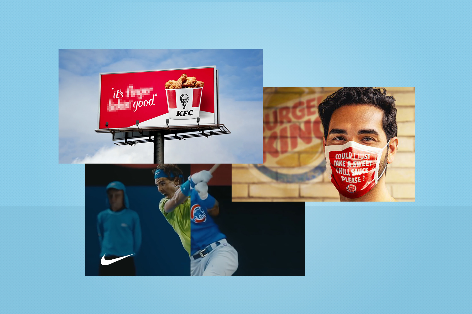
Take this most recent KFC commercial. Sure, it doesn’t address all the seriousness of the coronavirus, or even really make literal sense, as some viewers point out in the comments. But it does give KFC a way to join the conversation, and to make you stop and think about their brand slogan (and finger-lickin’ good chicken). 

Another more guerilla tactic is the one Burger King Belgium implemented: face masks printed with your order when you place a pick-up through their app. Again, this idea hits a number of markers, but mostly it’s giving their customers a little extra something of interest, while also leaning into the norms we’ve come to know.

Burger King mask example

Or a more subtle, yet strong, approach to the current times, Nike released an ad for their Nike Membership with the slogan, “You can’t stop sport. You can’t stop us.” The ad is so typical Nike, with all the emotion and buildup that comes from sports, but weaving in the most current feelings: cleaning bleachers, playing sports with masks, without crowds, and inside your home. 

Thinking about these same strategies, and what makes them successful, can help lead timely and impactful messaging no matter where your brand is speaking to customers. Emails, social media posts, digital or traditional advertising…the truth is simple: people connect with messages that resonate. And what resonates right now are the current events that encompass us all.

As you think about what you’re putting out there, or about to put out there, first ask yourself how this pandemic has affected your customers. Not in general terms, but specifically how your company being affected has trickled down to them. That is how to leverage creative in a thought-provoking way. As Burger King showed us, it’s not just about wearing a mask–it’s how wearing a mask affects ordering their food. Or in Nike’s case, how social distancing won’t stop the sports you love. 

Fundamentals of Data Visualization

Multiple examples of data visualization to help guide users through information.

Visualizing information can seem like an easy fix for any piece of content: simply add an image to the copy and voilà, your job is done. And while it is possible to think in those simple terms, it takes more strategy and depth to visualize data in a way that really draws the reader’s eye, helps them process your information quickly, and keeps them wanting to learn more. 

Thinking about what type of data to visualize or leave as text, and how to visualize, takes into considerations these questions:

  • How much time does a user have to look at the information?
  • What is the value in adding a chart, icon or other visual? 
  • How complex is the information/can it be simplified? 
  • How can the data best be portrayed to keep the viewer interested? 
  • What type of visual will best lead the eye to important parts?

These needs and values can vary depending on who your audience is and how summarized or detailed they need the data set to be. For example, one of the sections below features information for medical professionals, and the other for pet owners. Veterinarians may need, and be interested in, a more detailed chart, whereas a pet owner would digest the same information in a much simpler graphic. Here are a few examples of visualizing data:

Infographics

This is the most simple way to visualize. While some infographics are used simply to keep interest on a page, they can be formed in a way to quickly visualize numbers, or a change in data. This is a great tool when larger graphs or other ways will not fit. 

Example of infographics

It is also possible to add branding to an infographic. This example gives the audience a quick visual of the number highlighted, while at the same time using branded graphics and design to make a deeper impression. 

Example of infographics with branding.

Simple Visuals

Taking infographics to a step above, visuals can be created to share small amounts of data or facts in a way that is easily digestible. Many times these visuals can be accompanied by the fact within text, giving audiences two ways to remember the information. 

Color Coding & Imagery

For large amounts of data, visualizing with colors and recognizable imagery can help people sort complicated information in a faster way. This chart was used to convey a long-term schedule with multiple data points, using colors and icons that could be quickly recognized and cross-referenced to other areas within the website, and product labels, to reiterate importance. 

Example of color coded imagery.

Interactive 

Motion or user-led interaction can simplify or complicate your data, and a good strategy should be in place anytime this type is chosen. When used properly, interactive visuals can keep users fixed on a certain data point for longer than with a static image. This can also help with data recall and other positive communication points. Even though creating these visuals may be more complicated, the end result should feel simple and user-friendly. 

In the example below the date slider at the bottom allows users to see Dog Flu grow within states in a simple way, whereas plotting every case with a dot would have overwhelmed the visual with large clusters, and the point of the visual would have been lost. 

Example of interactive visual data.

When choosing visuals to use, keep in mind all of the options and your audience needs. There isn’t a one-size-fits-all way to visualize. Especially in cases where large amounts of data are included, mixing types can help keep the reader interested. Even text callouts can be just as useful in highlighting data, and may be exactly what the audience needs.

Read This Before Trying Headless CMS for Your Website

A depiction of headless CMS using a robot extending to different viewing platforms.

Audiences are continually consuming information in different capacities, and your website is no different. Remember when everyone accessed content on a desktop? Fast forward to mobile entering the picture, then overshadowing desktop consumption. Along came mobile-optimized and responsive websites. 

Now we’re seeing content consumed across multiple platforms, including mobile apps. From a user experience the most important thing is to connect with your customers in a way that most resonates with them–for websites that translates to building something that is easy to use and quick for them to digest what’s important, and what they’re searching for. 

From a development standpoint, building something that can easily adapt is key. Creating a well-built website is no joke. It takes time, planning and man hours–all things that most companies need to work into their budget and growth strategy. So how do you share all that content without building out the front-end for each separate device? Enter the headless CMS. 

What is a headless CMS?

A headless CMS is a content management system (CMS) with only a backend. The function is to be more of a repository, think about it like the database storing all of your website information. The content is then accessible via a RESTful API that can be displayed on any device.

The term “headless” is fairly literal to what is happening. The concept is that we are removing the “head” (the front end, or website) off the “body” (the back end, or content repository). A headless CMS’s core functions are to store and deliver structured content.

Why use a headless CMS?

Just like most solutions, a headless CMS is not a need for every company or website. It is built as an option for those who could benefit. For one example, a headless CMS creates greater flexibility for developers but not designers. At a basic level, a headless content management is best used for:

  • Content that needs to be published across various platforms
  • Websites with a lot of content across many pages
  • Websites and apps utilizing JavaScript frameworks (e.g., VueJS, React or AngularJS)
  • Websites created with a static site generator (e.g., Gatsby and Jekyll)

Headless CMS Options

Two of the most popular options are WordPress and Drupal. While these can have multiple ways to create a website, both can be fitted to accommodate headless CMS.

In the case of WordPress, your data can be made headless by using plugin functions like the WordPress REST API and Create React App. This allows the functionality and flexibility a headless CMS needs. 

Drupal 8 is also referred to as “decoupled Drupal,” and is a very popular option for headless CMS. This system has an API-first architecture. This focus helps if your company strategy involves targeting mobile, resellers, or the multi-platforms we’ve discussed here already. Drupal core comes with the RESTful Web Services module. Drupal 8 is currently used by Weather.com, The Tonight Show, and Warner Music Group. 

Should You Use Headless CMS? 

Like all good planning and management, the best way to decide if a headless CMS would benefit your data would be to have a clear strategy for your audience and their needs.

  • How is your audience consuming content?
  • What flexibility do you need?
  • How many pages of content do you need? 

Asking a few questions like these can help uncover the pros and cons for your brand, and lead developers to create the best solve for your website.